Quantcast
Channel: Color For Your Home Interior – Sensational Color
Viewing all 25 articles
Browse latest View live

California Paints

$
0
0

California Paints Logo

California Paint: Made in Massachusetts

Don't let the name fool you into thinking that this paint has to do with the west coast. This is an east coast company making paint right for home throughout the country. Whether restoring an historic home to its former glory or sprucing up a teen's room, I think you'll be inspired by the palettes full of colors from California Paints. California Paint

Colors inspired by the Historical Homes of America

California Paint gets a thumbs up from me when it comes to providing colors inspired by the historical homes of America. Working with Historic New England, they have created a guide to color, style and architectural periods so you can easily see the color schemes associated with different periods in American history. I like that you can see the colors three ways:
  1. Arranged by hue for easy comparisons
  2. Associated with various architectural periods, or
  3. On the 83 historic structures restored by the Newport Restoration Foundation in and around Newport, Rhode Island.

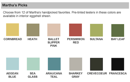
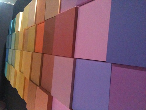
Palettes full of unique, fun color names

For me, the most fun aspect of this site is the uniqueness of their color names.  In the Tween and Teen Zone palette, for example, you'll find colors like Knock First, Lighten Up, and Grounded for Life (names any parent can relate to).  Be sure to check out the creative color names in the specialty palettes Their schemes and inspiration section offers a limited library of nice photos to flip through and they recently  launched an Online Color Center, a set of media-rich online color tools that enable you to interactively create unique and personalized paint color schemes. You can now easily view California’s colors by navigating the interactive fandeck or virtually leafing through the electronic color cards.  Their color mapping technology makes it easy to search for colors and suggest schemes based on color science and theory. Having a particular paint problem?  The Problem Solving Page will help you identify and give you tips on how to solve your painting problem.

California Paints recently launched a color blog.  It is updated weekly and the entries are nicely done.

Go directly to the company website: California Paints

The post California Paints appeared first on Sensational Color.


Disney Paint

$
0
0

Disney Paint By Glidden Paint

Disney Paint By Glidden Paint

Disney Paint Specially Formulated For Kids Rooms

Disney Paint is produced by Glidden and is available only at Walmart. The colors are bright and fun with names like Pluto's Paws, Shorts Sighted, and Definitely Donald, kids will love these paint colors.
These exclusive paint colors and specialty finishes make achieving the most exciting kids' room ideas surprisingly easy and affordable. Reinvent the whole room, or add a simple accent that sparkles, gleams, glows or turns your wall into a chalkboard! You can even use Disney specialty finishes over existing paint colors. For a totally unified look, combine Disney paint colors and specialty finishes with Disney bedding and accessories.

Only Disney Paint Colors and Finishes Bring the Story to Life

Disney Paint By Glidden Paint Add glitter, sparkle, glow-in-the-dark or even metallic or chalkboard! When painting a bedroom, playroom or game room these finishes are sure to delight your child or tween! Disney paint makes decorating fun for your kids and you. Check out the color, tips and how-to videos here

The post Disney Paint appeared first on Sensational Color.

Crayola Paint

$
0
0

Crayola Paint

Crayola PaintCrayola Paint: Color For Kids

I have always had an affinity for crayons and their limitless color options, I even keep a big box of sixty-four on my desk for inspiration. You and your children can also be inspired by the nearly 100 bright and bold colors options offered by Dutch Boy’s Crayola Paint Color Palette. Choosing color for the little ones, tweens or teen’s spaces has never been easier using Crayola’s extra-large crayon shaped paint chips. One thing in kid’s spaces that is imperative is the ability to use kid-friendly paint that stands up to dirty fingers, messy spills or the occasional magic marker on the wall. Dutch Boy has teamed up with Crayola to create resilient paint that appeals to both kids and their parents. They have even created “Idea Cards” to help motivate you to try some new design in the room. Using cute names like Wild Blue Yonder, Crayola can help your little guy get on board with that nice shade of blue you’ve been hoping for, instead of the sea of black he originally wanted. You and your child can even visit the Crayola Paint Color website for inspirational photos, design tools and a full array of fun online imagination games to keep them busy while you’re painting. Let your kids dream up a paint color scheme at Dutch Boy

The post Crayola Paint appeared first on Sensational Color.

C2 Paint

$
0
0

C2 Paint Logo

C2 Paints 16-Colorant System

Though available in fewer than 100 storefronts across the country C2 Paint has a developed a following among discerning color lovers. This small but innovative paint company is one of the few available in the U.S. whose colors are made from a 16–colorants system rather than the 12–colorants used by most paint brands. C2 also uses a high quality paint base that when combined with the colorants produces rich, vibrant colors.

C2 Paint cans

C2 Ultimate Paint Chip

C2 Paint first caught my attention when they came out with the first pre-painted poster board sized paint sample sheets. I thought this was a simply brilliant idea. No more little paint pots, or sample boards or foam brushes and for those of us with little patience when wanting to see how a color will look-- no more waiting for the paint to dry!

What a time saver for designers and homeowners. Best of all the samples is covered with actual paint and is large enough (18' x 24") to give you a good idea of what the color will actually look like on the wall.

I've always been an advocate of sampling the actual paint color on boards and looking at it at different times of day and in different positions around the room to confirm the color is one you love and want to live with. So many people skip this step because of the extra work. C2 has overcome that problem. It doesn't get much simpler than toting a pre-painted board home from the store ready to place in your room.

Cooperative Color

Another thing I like about C2 Paints is that it is a cooperative rather than a traditional company. What this means is that the C2 is owned by independent paint dealers who for years have been helping designers and homeowners in their communities beautify their homes. While a business structure doesn't necessarily guarantee a great product I like the idea of having the product direction set by a group of dealers who understand not only their customers but that their continued success depends on selling a paint line that is not only high quality but has some unique features not available from the bigger brands.

Go to the C2 Paint website  

The post C2 Paint appeared first on Sensational Color.

YOLO Colorhouse Paint

$
0
0

YOLO Colorhouse Paint

YOLO Colorhouse Paint

YOLO Colorhouse Paint: We believe the world can be more colorful and less volatile! Do you?

Ever wish you could paint a room and barely smell a thing? YOLO Colorhouse Paint has made your wish, their command. An environmentally responsible paint with a natural color palette, YOLO offers versatility with a conscience. No volatile organic compounds (VOC) paint ensures no odor and absolutely no toxic fumes . Only durable, washable and fantastic color choices inspired by nature. YOLO Colorhouse paints are Green Seal® certified, the Green Seal® certification automatically qualifies YOLO Colorhouse® for LEED certified projects.

Interior Paint with Artist's Flair

YOLO Colorhouse was created by artists with a relaxing, approachable vibe in mind. With collections including The Earth’s Color Collection InsideThe Color of Hope and the little YOLO Sprout collection for children's spaces, YOLO Colorhouse has incorporated soothing palettes that create flow and energy in a space.

Still have a color in mind not available in their nearly 100 choices? YOLO Colorhouse offers a color match option as well.

Inspiration & Design

YOLO Colorhouse's website offers great inspiration like fun how-to videos and designer's portfolios. Paint is available for purchase at many retailers including Home Depot. In-store Design Kits with 8" x 11" full color cards are available for purchase. Color Cards provide tips for where to use their color and what other YOLO colors will complement your design - great inspiration for designers and homeowners alike. Learn more about YOLO Colorhouse on their website  

The post YOLO Colorhouse Paint appeared first on Sensational Color.

Martha Stewart Paint

$
0
0

Martha Stewart Paint Can

Keeping Up With Martha Stewart Paint

Martha Stewart Paint has jumped between brands and stores so if you are having a hard time keeping tabs on where to find it you aren't alone. Currently being produced by Glidden and sold at Home Depot the Martha Stewart Living Paint collection has 280 colors. Martha Stewart Paint Picks This incredible palette selection also comes with the added benefit of  an easy-to-use color symbol keys that can help when it comes to combining colors.

Martha Stewart remains a decorating favorite because she instructs us on how to make everything in our home more beautiful.

See more about Martha Stewart paint and fanguides at Home Depot  

The post Martha Stewart Paint appeared first on Sensational Color.

Benjamin Moore Paint

$
0
0

Benjamin Moore Paint

Benjamin Moore Paints: Since 1883

Ben and I have history. In my younger days, apart from my fling with Ralph Lauren, we had an almost exclusive relationship. We painted many homes together and the charm of some of the colors from those early days has never worn off. Those colors choices are still among my go-to favorites. Today, I have many intriguing paint options vying for my attention. So, what might make me come back to Ben now and what might cause me to stray? Benjamin Moore Paint Why stay? Ben offers me a vast range of colors and finishes, delivers quality, has all of the latest and greatest digital tools and is easily accessible. Just what a gal needs...and would expect from her paint. So, Why stray? This big boy seems to have run low on original ideas and appears to have tried to model some of the fresh concepts of the younger upstart brands. I may not like it, but it really isn't uncommon among the bigger guys. One would expect that Ben would take it further and push the envelope. Instead, in every case I have been disappointed. Just like so many fresh ideas that go corporate - they get stale around the edges. That being said, let's take a closer look at some of the things I do still find attractive about Ben today: Color Capture - Ever walk through a furniture store or design space and fall in love with a color? Wish you knew the name? Well now, in keeping up with technology, Ben has introduced an amazing downloadable app. This innovative tool allows an IPhone or Android user the ability to simply snap a photo of the color that caught your eye and instantly color match it to the corresponding Benjamin Moore choice. I love that you could even upload that color match to Facebook or Twitter and ask friends for their opinion.  Accessibility and a color wheel are available tools with the download. No more guessing at that ‘right’ blue or trying to get that yellow just like you saw it in the store. Color Life Online Magazine hasn’t forgotten about the IPad or Android Tablet users offering the ultimate tool for motivation and creativity. Each issue offers readers color background, suggestions and trend. Through access to interactive pages, design tools and pro-advice this online magazine really bumps up the inspiration and innovation to Benjamin Moore fans. Historic Color Choices My family lives not far from the historic streets of Williamsburg, VA. Naturally, this has become a place dear to my heart. So when Ben acquired production of the Williamsburg Collection of Colors, I took notice. The palette now has 144 historic American colors derived from classic American design. Based on original pigments developed more than 250 years ago, these colors are considered timeless for today's homes. Ben Marries Pottery Barn Let’s not forget how brilliant I thought it was when Benjamin Moore joined forces with Pottery Barn. At the time, decorating inspired by Pottery Barn was all the rage. This was an opportunity too good for Ben to miss. Home Decorators have been happily picking paint for their spaces straight from the pages of the Pottery Barn catalog. Pottery Barn even has a search tool on their website that allows you to search for the paint color you see in any of their catalogs. It’s the ultimate in try, before you buy. See everything Benjamin Moore Paint has to offer on their website  

The post Benjamin Moore Paint appeared first on Sensational Color.

Farrow & Ball Paint

$
0
0

Farrow & Ball Paint

Farrow & Ball Paint: Unrivaled Depth of Colour & Traditional Formula

Origins in Dorset, England have led Farrow & Ball Paint to stay true to their roots. Their handmade wallpapers and uniquely intense color palette has made them a true upscale paint. Farrow & Ball Paint What I enjoy most about Farrow & Ball is that their paints contain a high amount of pigment allowing for rich depth, unmatched by other products. Using a distinctive range of colors and finishes Farrow & Ball has really gone to great lengths to preserve their high-quality product. Offering an "edited" display of colors, at only 132 choices, Farrow & Ball has honed in on a specific selection of choices running the gamut in traditional or contemporary design. In keeping with a more high-end theme, they have a separate inspiration site full of style and color. Check out Farrow & Ball Paint and Wallpaper, all handcrafted and based on tradition.  

The post Farrow & Ball Paint appeared first on Sensational Color.


Pantone Paint

$
0
0

Pantone Paint

Pantone Paint: Color System Meets Paint Palette

Pantone has long been a name recognized by designers as the leader in color matching. It is a system widely used to communicate color from one person to another when the two aren't in the same location. For example, a designer in NYC can tell a manufacturer in Asia exactly what color they require just by giving them the Pantone reference number . No guessing because both will be referring to the same color. For over 10 years, Pantone has released an official Color of the Year, enabling them to grab attention of many people outside the design field. Pantone is now more widely known and they are hoping to take their success with color palettes to paints. Pantone Paint Fanguide

Pantone Paint At Lowes

When Pantone first ventured into the paint business, they went very high end offering a wide array of colors. It just never seemed like the route to success for taking this brand into paint to me. Partnering with brands Valspar and Lowe's is a much better fit and makes their paint range much more accessible to their current fans and connects them with many potential customers outside the design community. Bringing Pantone's color expertise, vision and design sense to the consumer, the Pantone Paint Collection by Valspar features 100 on-trend hues ranging from classic neutrals to the latest brights. Design-savvy customers can experiment with color in their home and rest easy with Pantone's inspiring color palettes. From cool neutrals to hot hues, take your paint cues from the world’s color authority.    

The post Pantone Paint appeared first on Sensational Color.

Valspar Paint

$
0
0

Valspar Paint

Valspar Paint: The Emotional Value of Color

One of my favorite advertisements for paint was this 2011 spot for Hi-Def Valspar Paint. The imagery, the electricity, the sound all combine to engage the sense around color. Not easy to do when selling paint. I think the secret to the success in this ad is the 30 secs sell color and our connection to it more than paint; yet it grabs and makes the brand memorable. The paint color in the ad made me think of Yves Klein International Blue. I wondered if the connection was intentional because of it being known for its intense vibrant blue. Even if it wasn't, this bright blue was the right color.
The right color won't only brighten up a room; it can transform your life. Although some may try, no other company appreciates the deep emotional value of color like Valspar.  ~from Valspar About Us
Holding true to that vision, Valspar has come a long way from being what many once thought of as simply a "big box" brand to a creative player in the paint arena. They continue to try to create an emotional connection between customer and color. One of the ways they do this is In addition to their own color range, partnering with other recognized brands to create boutique color lines.

Valspar Color Boutiques

Pantone Universe Bringing Pantone's color expertise, vision and design sense to the consumer, the PANTONE UNIVERSE Paint Collection by Valspar features 100 on-trend hues ranging from classic neutrals to the latest brights. Design-savvy customers can experiment with color in their home and rest easy with Pantone's inspiring color palettes.

National Trust Historic Colors The National Trust has worked extensively with the Valspar Corporation to develop an exclusive collection of historical colors that are available exclusively at Lowe's. Valspar features 250 colors certified by the National Trust, having been developed from samples taken from the Trust's Historic Sites: examples include Woodrow Wilson Presidential Ivory, Lyndhurst Duchess Gold, and Woodlawn Plantation Pear.

Allen + Roth The Allen + Roth® paint palette is a mixture of abundant rich neutrals and etherial earth tones. Their tagline, "Classic color with a modern twist" is represented through their simple decorator's paint chips - popping color companions are paired together with their traditional hues to make it easy to choose accent walls or architectural feature highlights. Eddie Bauer The Eddie Bauer Paint palette is all about classic American color. With 192 beautiful options built around their love of nature, Eddie Bauer represents true appreciation of the outdoors. The Eddie Bauer classic home furnishings and decor collections were created to perfectly coordinate with their paint line. Find the Valspar paint color that connects with you.

The post Valspar Paint appeared first on Sensational Color.

Auro Paint

$
0
0

Auro Paint

Auro Paint: An All-Natural Alternative

Auro Paint offers “eco-friendly” options, made from all-natural ingredients. Based in Germany, Auro designed a line of natural paint that they say is so safe to use it can actually be composted. Ingredients like orange oil and rosemary, replace synthetic chemicals. The line is now available in the United States through Golden Green, a distributor based in Oregon. Dr. Hermann Fischer, a paint industry chemist founded Auro Paint about 30 years ago. Fischer was convinced that the only way to avoid health and environmental hazards from paint would be to switch to all-natural ingredients. Auro Paint According to the Guardian
Its (Auro Paint) gloss paint is an Ethical Consumer's best buy.
Auro Paint offers paints and primers that are safe for the environment. They even offer a paint pigment that you mix with water. Learn more about the entire line at their website.

The post Auro Paint appeared first on Sensational Color.

Dunn-Edwards Paint

$
0
0

Dunn-Edwards Paint

Dunn-Edwards Paint : Made in the Southwest for the Southwest

Dunn-Edwards Paint is the foremost manufacturer and supplier in the Southwestern United States. Their paint covers everything from the Museum of Modern Art in San Francisco to the Orange County Jail and the Albuquerque International Airport.

Dunn-Edwards Paint Wall

Yes, this is quality paint both for home interiors and exteriors. It comes in every color you might need and is especially made to suit the region. All good stuff especially if you live in the Southwest.

But even if you don't Dunn-Edwards Paint has a great online magazine that you should know about. It is called SPECS + SPACES The page are filled with color and design information that is both inspirational and educational. Go now and check it out or visit Dunn-Edward Paint website.

The post Dunn-Edwards Paint appeared first on Sensational Color.

Ellen Kennon Full Spectrum Paints Introduces The Designer’s Palette

$
0
0

Ellen Kennon Full Spectrum Paints

The designers, architects and color consultants who have given me such support and inspiration over the years inspired Ellen to put together Ellen Kennon Full Spectrum Paints Designer's Palette. I am thrilled to have been invited to have a color included.

Ellen Kennon Full Spectrum Paints  h2ahh!

“H2 Ahh!” is my color in The Designer's Palette


Here’s what I shared with Ellen about my signature color:

I love the colors of water. All of the hues from the deepest, most mysterious sea blues to the soothing, subtle spa blues speak to me and "H2 Ahh!" captures all of what attracts me to these watery colors.

Inspired by the color water in a warm, relaxing bath, the complexity of "H2 Ahh!" gives it a sophistication that intrigues my mind and the perfect balance of this color has a meditative effect that captures my soul.

'H2 Ahh!' is a timeless hue that works beautifully with all other colors. When combined with rich tan, chocolate brown, antique gold, olive green, burnt oranges, or even navy blue, gray or rosy pink it gives the combination a sense of the unexpected making it more interesting to the eye.

See all of the colors  that Ellen created with some of the countries most talented designers, architects and color consultants. The Designer’s Palette includes colors representing 14 designers who use our full spectrum paints in a variety of applications and lighting conditions

Ellen Kennon Full Spectrum Paints

Meet the other 15 designers and read what they have to say about their colors in Ellen's newsletter...

The Designer's Palette and all of the Full Spectrum Paint Colors are available at www.ellenkennon.com

The post Ellen Kennon Full Spectrum Paints Introduces The Designer’s Palette appeared first on Sensational Color.

Color Your World with Feng Shui

$
0
0

feng shui bagua map floor plan

Running through our busy lives we often wish there were a way to achieve more calm or just a little more time to accomplish things. It is possible to carve out tranquility and even increase energy right in our own homes. As Winston Churchill once said, “We shape our dwellings, and afterwards, our dwellings shape us.”

Feng Shui, the ancient Eastern practice of correct furniture placement and creating a ‘Zen’ or tranquil atmosphere, suggests that our entire being is actually influenced by the space around us. Feng, meaning ‘wind’ and Shui meaning ‘water’ combine to create color and design elements in your home that can bring both relaxation and serenity or heighten energy and productivity.

<a href="http://www.sensationalcolor.com/wp-content/uploads/2012/02/bagua3-Recovered.jpg"><img class="aligncenter size-full wp-image-11768" alt="Color Your World with Feng Shui" src="http://www.sensationalcolor.com/wp-content/uploads/2012/02/bagua3-Recovered.jpg" width="600" height="425" /></a>

source

Five Elements and Color

Just as nature includes the components of Fire, Earth, Metal, Water and Wood - the human body contains these elements as well. A well-balanced Feng-Shui home keeps in mind the Five Elements when designing to ensure all are represented so proper energy can flow in the space.

One of the easiest ways to bring in Feng Shui is through color. Warm colors can energize, lighten and animate your state of mind. Cooler color choices can soothe, relax or rejuvenate you.

Paint a room the ‘wrong’ color choice and achieve a whole different reflection than what you were trying to achieve. Picked blue because you thought it energized your front stoop? Well, in actuality it is creating a soothing, serene welcome to your and your guests. A great outcome, but not exactly what you were going for…

According to the principles behind Feng Shui, color can even impact something as simple as your doorway. A red doorway inspires passion as you enter the home, a blue one offers a place for serenity, infuse yellow for a center of happiness and joy.

Confused as to what color brings what Chi? This is where a valuable Feng Shui tool comes in – The Bagua Map. This little blueprint of color holds the key to creating the correct Chi and color correlation in your space.

Feng Shui Bagua Floor PlanGraphic: Kate Smith

Feng Shui Color Tips

• In Your Kitchen – Painting your kitchen white allows the colorful dishes you prepare to speak for themselves. The kitchen’s element, which is naturally Fire, (hot reds, greens and yellows) is overcome by the element Metal (represented by the stark, pure White) thus creating the best balance in this space.

• In Your Bedroom – Rose, blush and subtle pinks create a perfect setting to increase love, so it is a natural bedroom color choice. Greens and blues allowing for calm and peacefulness are also great choices.

• In Your Dining Space – Eating together, flowing great conversation and sharing love are all achieved when you paint a dining room pink, green or blue. These colors are all stimulating, appetite-inducing choices that are great for keeping your hungry crowd satisfied.

• In the Bathroom – This high-traffic area can become an area of tremendous rush, as you get ready in the morning or at the end of a long day. Painting the bathroom in warm grays, blues, pinks or even white will create calm and serenity. These are often colors seen in a spa because they induce thoughts of the Water Element that offers purification for both mind and body.

Whatever room you choose to begin your Feng Shui journey, remember that your space has the power to define your state of mind and increase the energy for your well-being. Choose color wisely and your home will pay you back with more restful nights, more energized days and more abundant relationships.

The post Color Your World with Feng Shui appeared first on Sensational Color.

Color Scheme Inspiration: Vintage Carnival Palette

$
0
0

Nostalgic, fun and whimsy fill our color scheme inspiration. Hues selected from the photos of an old fashioned carnival will bring energy and vintage appeal to any space. Soft blues and lavenders and yellow tinted neutrals allow for a calm environment while more vibrant pops of green, turquoise, and yellow add energy. The neutral walls and furniture inContinue Reading

The post Color Scheme Inspiration: Vintage Carnival Palette appeared first on Sensational Color.


Classic Color: 4 Steps to Timeless Décor

$
0
0

Traditional Living Room in Teal

The classic look. The finest homes. That traditional and elegant feel isn’t something you can only get by looking at glossy magazine covers. You can create that same mood in your own home easily and affordably by simply choosing the right colors.

Two Classic Living Rooms- One Dark, One Light
Start creating that time-tested atmosphere in your room today with these five classic color tips:

1. Darker shades are a great way to convey an established old-world feel. Incorporate deep tones of gold, blue, green, or purple for a truly timeless feel. You might also choose colors like navy, hunter green, and burgundy, which top designers frequently use to convey style and refinement.

2. You need not worry about your traditionally decorated room being stuck in the “dark” ages. Consider adding a contemporary touch by using rich jewel tones, such as sapphire, teal, turquoise, amethyst, or emerald. These can add a brighter tone that lightens the room while retaining an elegant mood.

3. Remember, classic colors and styles don’t mean you need to reject any hint of the trendy. Add splashes of trendy colors in the form of accessories. This strategy allows you to have the traditional overall feel you want while giving you the opportunity to regularly switch out pieces that find their way onto the “out” list.

4. Consider using local history to guide your traditional color choices. If you live in the Southwest, for example, choose colors that convey the area’s past, such as shades of green, orange, and yellow. Dashes of turquoise are also a great way to add a color that’s classic for that part of the country. The next time you drive around town, take a look at the area’s historic homes to find color schemes that inspire you.

5. If you find comfort in traditional colors and décor, don’t limit that feel to formal areas like living rooms or dining rooms. It’s easy to evoke a classic mood in a bedroom or bathroom. For example, combine refined colors with a four-poster bed and detailed wood bureaus to create the kind of bedroom you’ll love to spend time in.

Fashion that classic feel you love so much right in your own home. By choosing traditional colors and the right accessories, you can evoke the elegance of eras past.

The post Classic Color: 4 Steps to Timeless Décor appeared first on Sensational Color.

5 Tips To Make Sure Your Accent Color Is On The Right Wall

Black and White Doesn’t Mean Dull

$
0
0

Black and White Living Room

When it comes to color, paradoxically enough, there’s nothing more striking and dramatic than black and white in a room. How could it not be when the basic facts stand - white reflects light and dark absorbs it?

Black and White Living Room
source: istockphoto

Not only can a simple black and white color scheme appear ‘orderly’ but the simplicity of it can also provide a much-needed sense of calm in today’s fast-paced world. Black and white interiors can also lend, not simply a ‘clean’ look to a room, but also some added sophistication and elegance – which means it looks great in retro apartments in particular. The color scheme can also provide a ‘playful’ and edgy look to a room, such as a black, white and grey bathroom with the bold fuchsia cabinets that enhance the dramatic look

Add in a few bright cushions and vases/picture frames and you have a whole new startling and rather dynamic look (and, in fact, any bright color would work well here). That’s because it draws the eye to focus on the spot of color.

Black and White Living Room
source: istockphoto

If you’re looking for warmth in the room then consider adding red or yellow. If your preference is for drama then its purple or electric blue you should be looking out for.

Designers famous for their love of black and white included the fashion queens Coco Chanel and Mary Quant. Meanwhile homeowners who want to stick with mainly black and white will want to give some thought as to how they plan to use the scheme overall before buying new furnishings.

It’s a good idea, for instance, for those who are not a fan of the overly-dramatic or dynamic themes, to have more white than black. That’s because painting the walls white allows more light to come in and gives the room a far more airy feel.

Black, white and fucshia bathroom
source: istockphoto

Then again, of course, there are those who prefer that ‘life on the darker side’ touch; black can look particularly stunning and inspiring, especially when the finish is glossy.

Try and avoid putting too many dark pieces together as this could make the room look a little on the oppressive side. Instead just tone in with the odd piece of dark furniture. And don’t forget about black and white pattern. It is a great way to add this scheme to any room and can lend a feminine or historical appeal to your décor.

The post Black and White Doesn’t Mean Dull appeared first on Sensational Color.

Three Places To Find Your Color Inspiration Today

$
0
0

Three Places To Find Your Color Inspiration - Travel Inspiration

Have you ever stared blankly at the hundreds of paint colors in the store display? Maybe you’ve paged through a design book that featured colors with odd names like oxblood or cerulean? Picking color doesn’t always seem so simple. But, in reality you don’t need to have an eye for design to create a color palette you’ll love to live in.

Three Places To Find Your Color Inspiration - Travel Inspiration
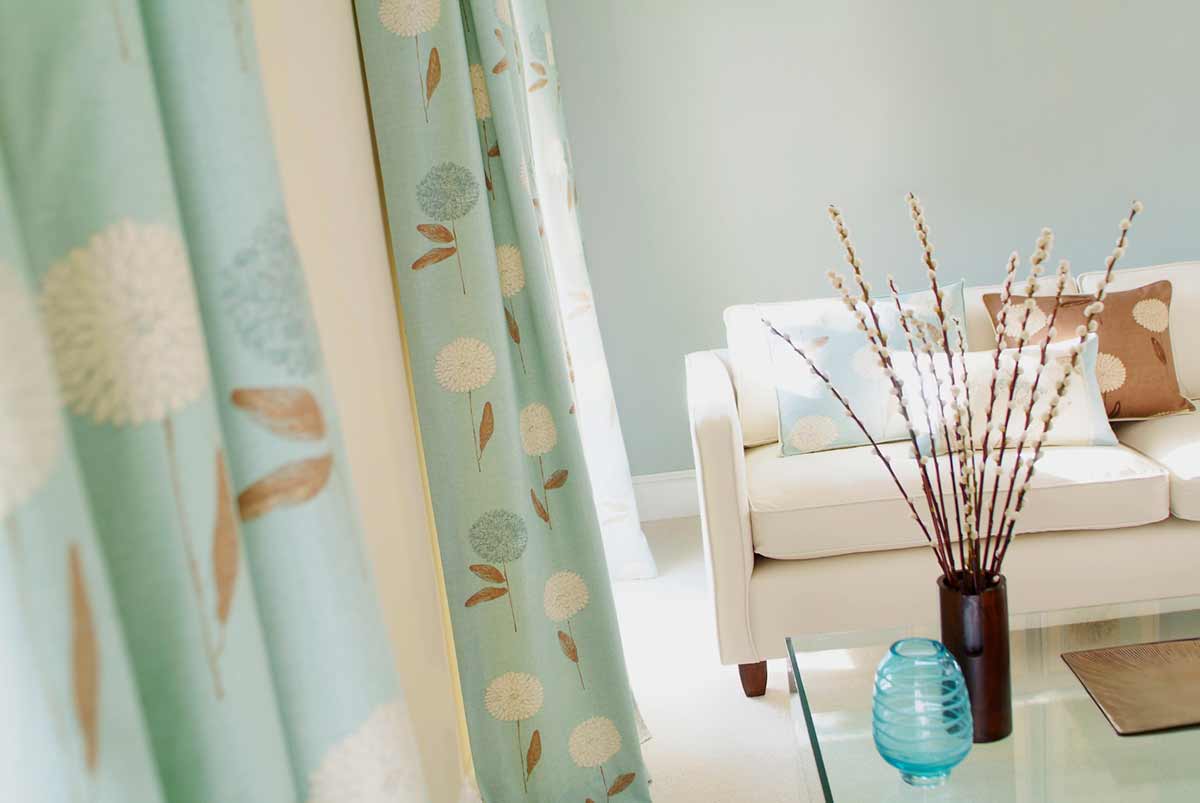
Here are three places you can look to today for color inspiration:

Go au natural
Never has there been a more inspired artist than Mother Nature. When you need to spur that decorating spirit, imagine the natural places where you love to spend time. Do you love to listen to the ocean as the surf tickles your toes? Then a green or blue scheme accented with a sandy neutral is an inspired choice.

Don’t forget to look outside your own window, either. Whether serene green lawns or yummy veggie gardens surround your home, you’ll find color schemes that stimulate your mind, soul, and even your senses.

Three Places To Find Your Color Inspiration - Designer Room

Go glossy
That’s right. The checkout counter is home to dozens of magazines. Home and garden magazines are the ideal place to start and will feature inspiring color schemes that use combinations that range from classic to chic. But don’t limit yourself to home-related publications. Pick up a fashion or celebrity magazine to find a creative spark in everything from advertisements to clothing layouts.

Three Places To Find Your Color Inspiration - Nature
Go with what you love
One of the easiest places to look for inspiration is in the things you love. Did your much-adored aunt give you the antique vase her husband purchased overseas? Does your 2-year-old’s crayon-and-marker interpretation of the cat make you smile each and every time you look at it? Take the colors you see in those contentment-inducing objects and incorporate them into your living space.

Of course, these aren’t the only places to find inspiration, but they will take you on the first step toward your journey in finding the perfect color that will create your perfect room.

The post Three Places To Find Your Color Inspiration Today appeared first on Sensational Color.

Create A Calming And Peaceful Environment With Color

$
0
0

Create a calming and peaceful environment with color master bedroom

Do you suffer from too much pressure, stress and never being able to unwind properly? If the answer’s yes then perhaps it’s time to alter the color scheme in your home to something a little more tranquil and relaxing.

Color therapists have known for decades that color affects mood and provokes physiological reactions. Being surrounded by a peaceful, calming color therefore could certainly make you feel that life is more under control and you are a little more serene.

Create a calming and peaceful environment with color master bedroom

For this reason alone, blue or lavender is often found in bedrooms and bathrooms. It’s also a good tone to have in an office, as it’s believed cool colors make us more productive. In fact, it’s a color which tends to be favoured by quiet, intellectual and reserved people and is thought to be one of the easiest colors to live with.

Light blue should be blended with medium and darker shades to provide balance in a room of blue hues but the predominant color should be light rather than dark blue. Brighter blues could be added with cushions, watercolor prints and vases.

Aqua blue and yellow are a fresh combination

Other ways to create more peaceful surroundings in your home include:

Decorating in predominately light, cool colors such as light blue, aqua, and lavender or light neutrals and use warmer colors more sparingly.

A child’s bedroom with its walls and drapes in aqua has a light, airy feel. The buttery yellow, white together with light carpet keep the feeling upbeat and youthful.

Downplay pattern and texture on fabrics, floors and wall coverings.

The pattern in this room is on the accessories rather than main pieces. Even then the subtler patterns are made up of lighter shades of blue and tan. This addition of patterns adds a bit of vigour to the room without being too energetic. It is a nice touch when placed against the more muted and neutral shades of light blue and cream.

Blue and neutrals give a fresh look to a living room

Keep contrast to a minimum

The light brown and aqua drape and pillows in this contemporary living room provide a contrast which isn’t too overwhelming. Since the patterns use two colors that are in subtle contrast to one another and each are light shades of their respective colors the room feels both fresh and calming.

Using light pastel blue, aqua or even green with neutrals or other colors that are does not create high contrast but will create a space that feels calming, relaxed and serene overall.

A monochromatic color scheme is often used to create a tranquil retreat.
Close up of calming blue bed-close up
How restful does this bedroom look with its soothing blue shades in a monochromatic palette?

The post Create A Calming And Peaceful Environment With Color appeared first on Sensational Color.

Viewing all 25 articles
Browse latest View live